
Understanding the missing faces in media
NIU Spring 2022
Senior Project
Programs Used
Adobe InDesign, Illustrator, Photoshop, XD, and SketchUp
Numerous studies have shown that missing people of color receive notably less media attention compared to their white counterparts. This exhibit would seek to inform visitors on the phenomenons at play as to why this occurs, as well as showcase a collection of missing persons in the Chicagoland area. Research was conducted, information was compiled, and an exhibit was designed in order to bring this idea to light.
The Introduction
These panels act as the introduction to both the subject and the exhibit, so they had to be communicative of the issues at hand. Larger type is used to represent the importance of the subject material.


The Issues
These information panels continue to inform and act as a representative barrier to understanding who these people are. I supplement the information with pictograms and graphs to create visual cohesiveness with the issues being talked about.


The Missing Faces
These panels feature the sixteen individuals who have received little to no media coverage on their case. The panels are sized to be reminiscent of a missing persons poster, and provide information to help in understanding the circumstances in their case, as well as details provided on their disappearance.


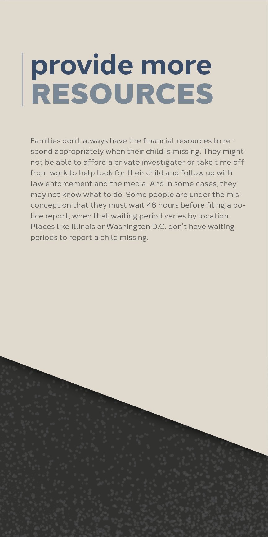
The Change
This section seeks to provide hope to the visitors attending by supplementing the information presented with a story of when a missing person was found. This section also provides ways that they can get involved in their communities.


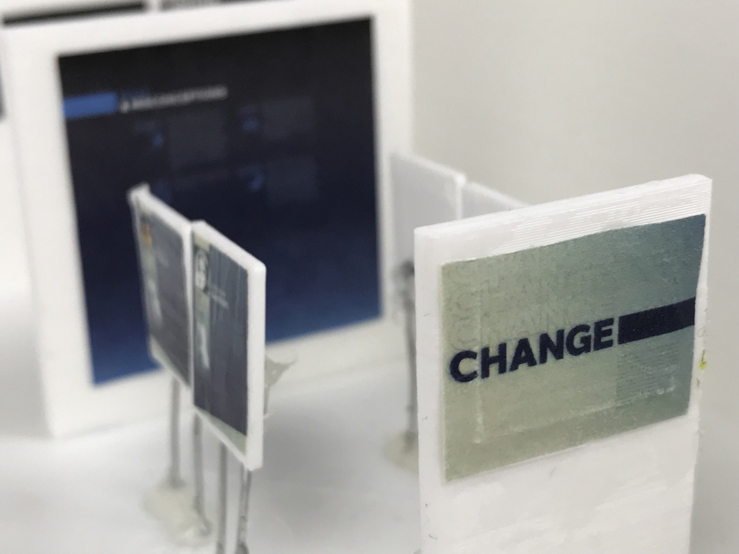
The Exhibit
While designing this exhibit, I had to keep in mind that the space had to be ADA accessible, which is a three-foot buffer around all items. Below you can find a collection of photos of the 3D print made of the exhibit, along with the panels placed in the area said panel would be found.


The Website
This website had to considerate of the in-person aspects of the exhibit, meaning they had to find out how get involved, and be able to donate. The design was kept simple, and got straight to the point. Images were muted to keep with the serious tone of the subject material.